StudentsChoice
Krishnan Chelakkarai Sivaraman | CS424 - Student’s Choice Presentation - An Analysis of the Beatles
Link to the original viz: https://public.tableau.com/app/profile/adam.e.mccann/viz/BeatlesAnalysis/BeatlesAnalysis
What is its purpose?
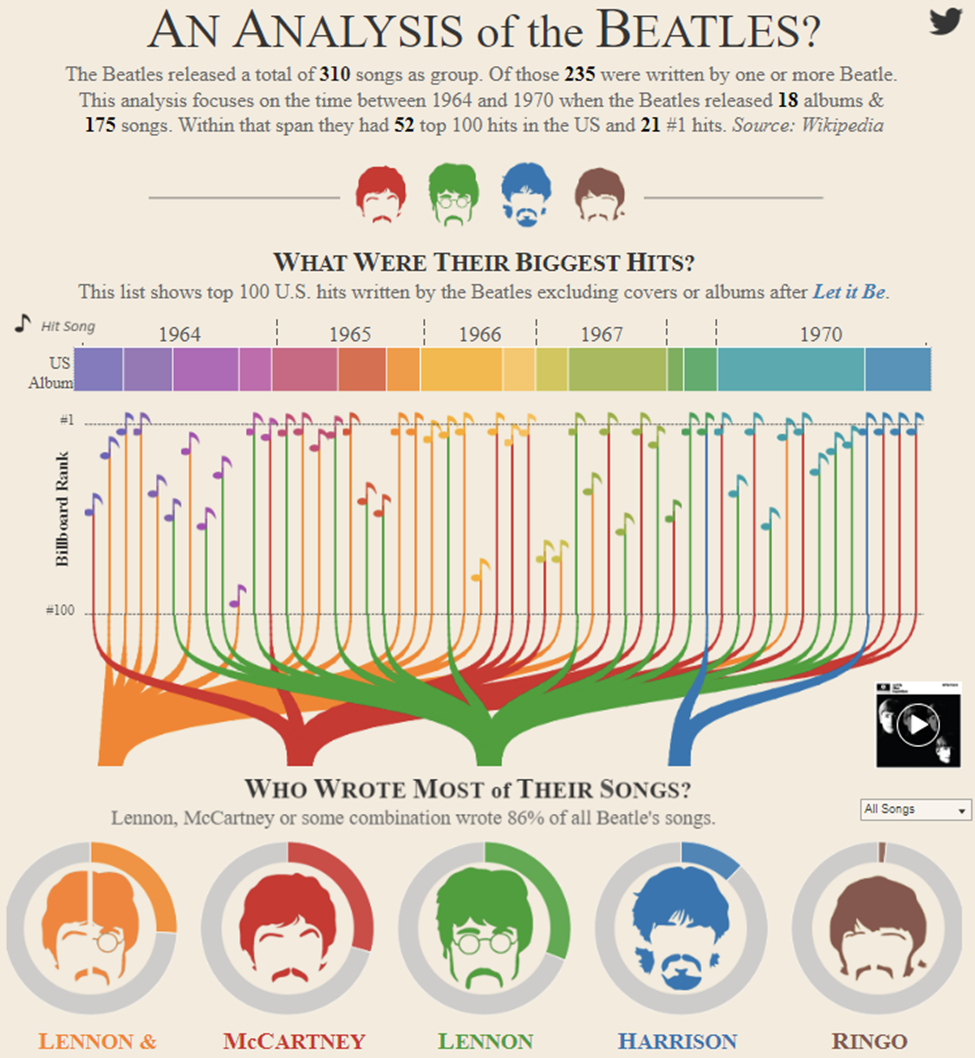
This interactive dashboard provides an informative peek under the hood of a band that is regularly argued to be the most impactful modern musicians of all time, The Beatles. The visualizations help the users to get an idea of the discography of the Beatles based on their US releases during their time together.
What is the data?
The main data is the list of the Beatles song hits and album releases in the US along with their writing credits. This data comprises 18 albums and 175 songs recorded by them from 1964 to 1970. It includes details such as song name, songwriter(s), year, album release name, and if it was a hit or not. For the last two plots, the data also includes the lyrics of the songs.
How was the data collected?
The song/album data comes from this Wikipedia page, https://en.wikipedia.org/wiki/List_of_songs_recorded_by_the_Beatle and the song lyrics data is taken from a Beatles fan site, http://beatlesnumber9.com/. Wikipedia pages are not a reliable source of data as they might not be consistently accurate and are only as good as its editors. The information it contains at a particular time could be vandalism, a work in progress, or simply incorrect. The Wikipedia page does include multiple references/notes/sources in the end which shows where the data was collected from. Although this does enable verifiability, it will require a lot of fact-checking to ensure integrity.
Who are the users that this visualization was made for?
This visualization was intended for anyone who is interested in the Beatles as it presents their discography in an easy to understand way. It is suited for a deep dive into the work of the Beatles as it not only presents their album/hit releases and individual contribution, but also presents an analysis of their song lyrics in terms of the number of unique words(excluding stopwords) used per song, and the words used most commonly across songs.
What questions do people want to ask?
This dashboard can help answer the a lot of including the questions below as stated above each visualization.
- What songs did the Beatles sing from 1964 to 1970?
- What were their biggest hits and when?
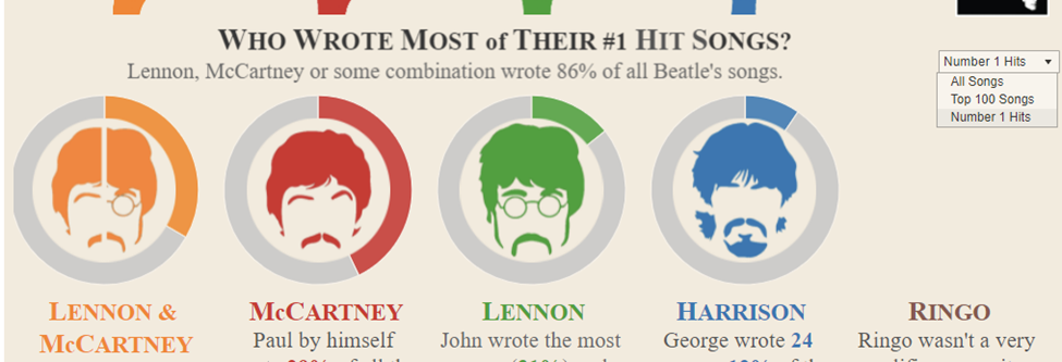
- Who wrote most of their songs?
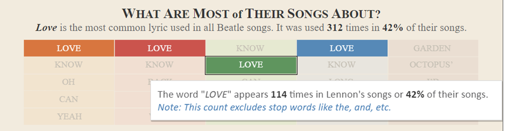
- What were most of their songs about?
- How did the members of the Beatles contribute to albums?
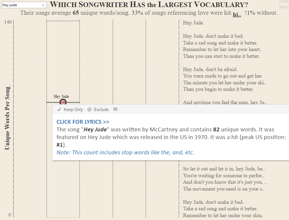
- Which songwriter has the largest vocabulary?
How can they find the answers with this tool?
There are basically 6 separate plots in this dashboard and using them they can find answers
1) Stacked bar (representing albums and year) 2) Bar chart/Dot plot (representing songs/billboard ranking) 3) Sankey chart (lines to the artists) 4) Donut chart (songwriter heads) 5) Text box (most used words in lyrics) 6) Jitter plot (largest vocabulary by artist)
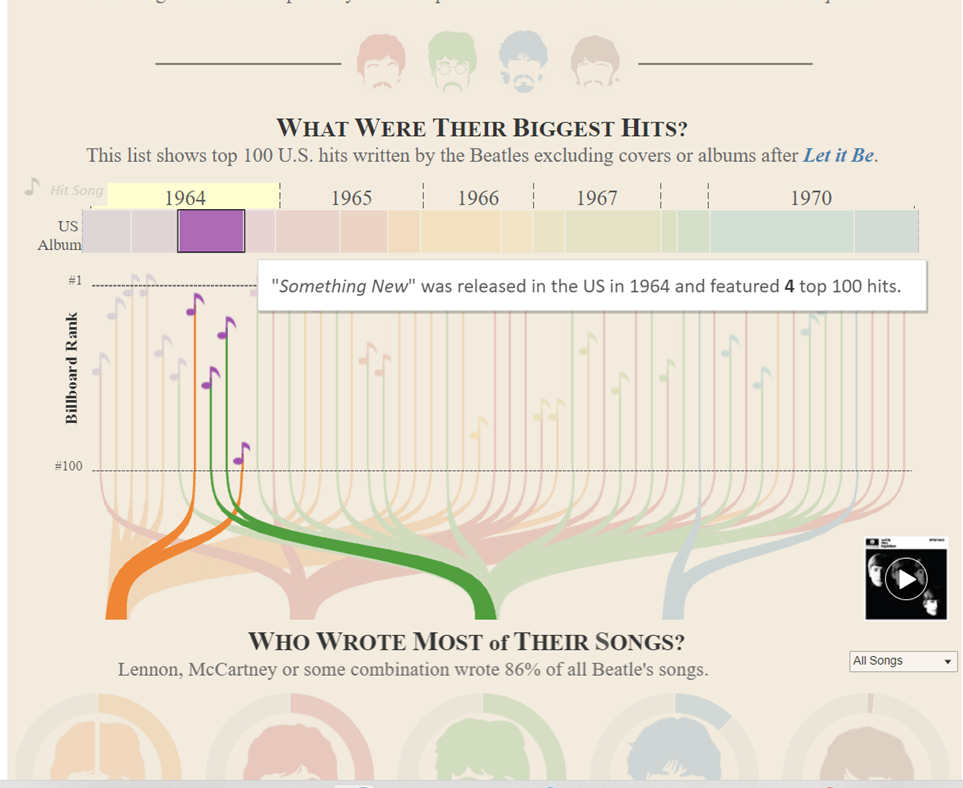
- The users can find out which album was released when and how many top 100 album hits it featured by interacting with the stacked bar plot. The user can also see what songs the Beatles released during that period using the dot plot. It also tells the user where the songs in that album ranked on the Billboard and #1 rankings are separated with a dotted line. On clicking the music icon/dot plot representing the songs and their ranking on billboard, the user can also hear a small snippet of the song, shown on the bottom right. For example, the user can see that the first big hit of the Beatles was I wanna hold your hand which was #1 in Billboard ranking in 1964.
- Used in combination with the donut chart below, the users can find who wrote most of the songs as well as when they had written them and their individual contribution to each album. The user can see that, initially McCartney wrote most songs with Lennon as a duo but in the later stages of the band, wrote songs mostly by himself.
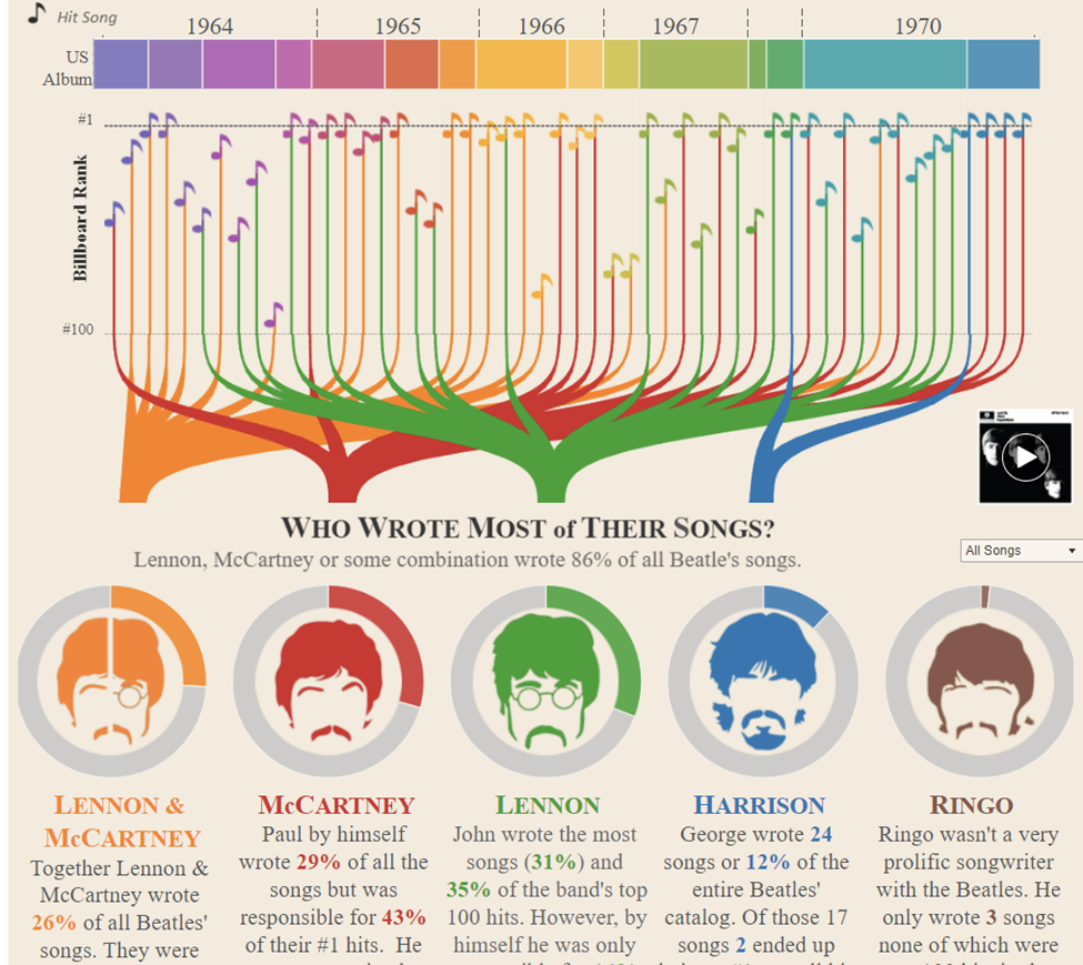
- The users can also choose from the dropdown to filter data and find who wrote most songs based on #1 hits, all songs or top 100 songs.
- The users can find out what the most of their song lyrics were about by using the interactive text box that visualized the top lyrics used by each of the songwriters. The user can see clearly that most of the songs by McCartney, Lennon and Harrison had the word love followed by know whereas Ringo’s songs had the words garden and octopus.
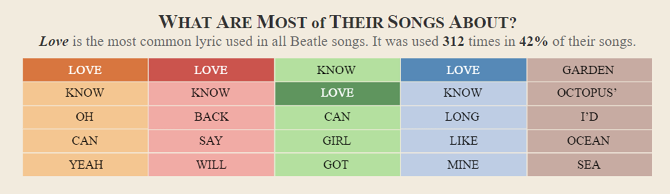
*On hovering, it also tells us how many times it has appeared in that writers songs.
- The user can also see which songwriter has the largest vocabulary using the interactive jitter plot shown below. The y-axis represents the number of unique words per song and the x-axis refers to the songwriter. The user can see that the McCartney-Lennon duo wrote songs with a rich vocabulary and that on average, all the songwriters had the same vocabulary. Additionally, the user can filter out songs on the plot that were a hit and had the word love by toggling the hit and love buttons respectively. The user can see that most hit songs had the word love in its lyrics.
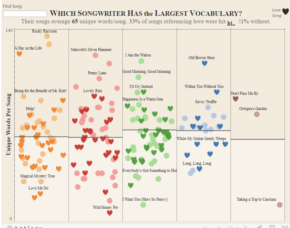
- It also has a handy search option on the left top to find a particular song to see how many unique words it contains and on clicking, the lyrics appear on the right.
What works?
- Overall, the visualizations are curated carefully so that they are presented artfully and also easy to understand.
- The color palette used is consistent, and colorblind-friendly.
- All the visualizations (except for the stacked bar plot) are organized such that the x axis is an ordinal scale that represents the songwriter.
- The author’s use of a sankey chart and smooth connecting lines was visually very pleasing. It links the stacked bar and the donut plots into one coherent piece thus presenting a lot more information.
- Overlaying minimalistic images of the songwriter(s) on the donut chart was a nice artful touch.
- The interactivity of the visualizations makes it fun and educational. It gives more control to the users, allowing them to select/highlight what they want to see.
- The plots also employ text popups that convey additional information and provide more context to the users. Even though it presents a lot of information, it is not overly complicated or cluttered.
- The stacked bar chart at the top also puts their time together into perspective. It is surprising to think how short the Beatles were together as I’d always thought it was much longer.
What needs improvement?
- The links to the data sources were not provided on the visualizations clearly, even though it is mentioned that the data was taken from Wikipedia. The absence of clear data sources and what manipulations were being done on it, make the visualizations tough to reproduce.
- Addition of an about page to help the user understand the many features of this app and its interactions would have also been very useful.
- Based on what word appeared most in their songs, one cannot derive what their songs were about. For example, the song might say I hate love and still be classified as a love song. The author’s definition of a love song as a song containing at least one lyric with word love is not intuitive. I would probably just change the wording as to what words they liked to use the most.
- The color scheme used for the songwriters are red for McCartney and green for Lennon and orange for them combined. One minor critique I’d give would be to use two colors, say, blue and yellow to represent McCartney and Lennon, and Green or other such combinations to represent them combined, to make it a tad bit more natural.
- On another minor note, the data is based on the US releases rather than the original UK releases, so it could cause confusion to people as many popular releases such as Rubber Soul and Revolver actually had different tracklists in US vs UK.