cs424-spring22
Krishnan Chelakkarai Sivaraman | CS424 - Student’s Choice Presentation
An Analysis of Beatles?
Introduction
Link to Shiny App: https://csk01.shinyapps.io/subway/
Youtube Video https://youtu.be/8CBXgb6cLjk
This App was built using R and Shiny. It visaulizes the Chicago CTA/Subway Ridership Data from 2001 to 2021.
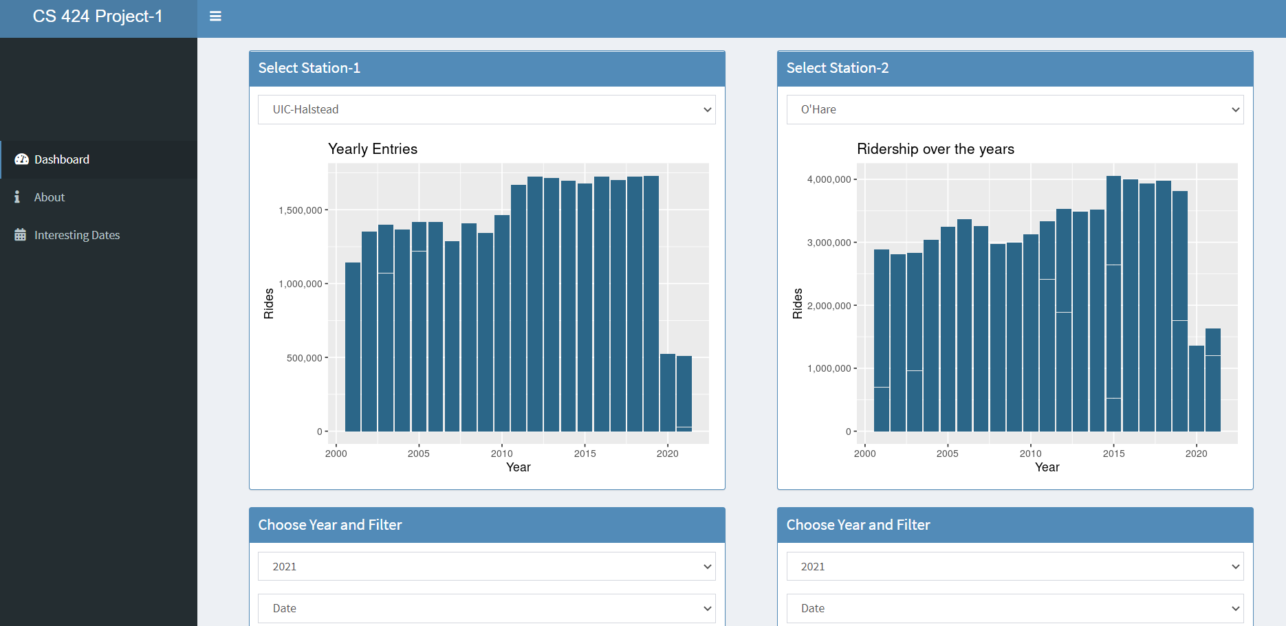
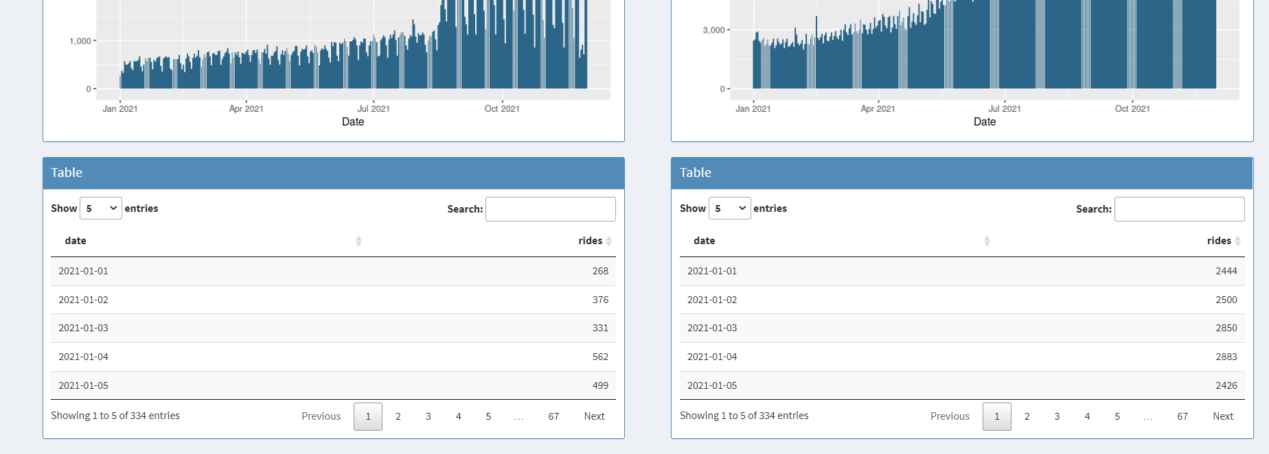
The landing page is a dashboard to let the user compare the entries at for each year. The first plot compares the entries at UIC-Halstead on the left section and O’Hare on the right section of the page. The user can select the station from the dropdown list to compare the stations(O’Hare, UIC-Halsted and Addison)
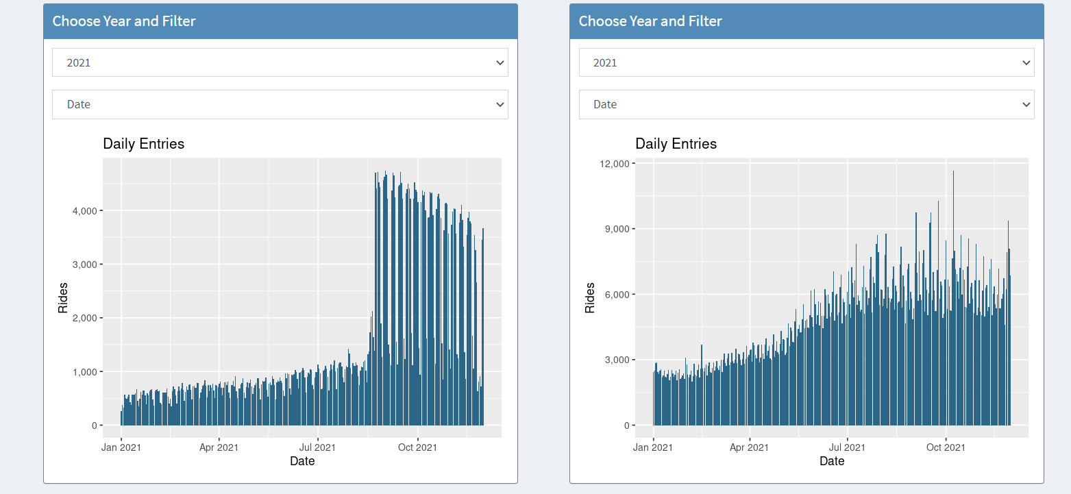
The second set of bar plots compare the total entries of a station in a given year based on the type of filter. The user can select the Year from the dropdown menu and the charts update for the chosen year. Likewise the User can choose to compare the data either per day, month or day of the week. The plots below shows the comparison of daily entries at UIC-Halstead vs O’Hare.
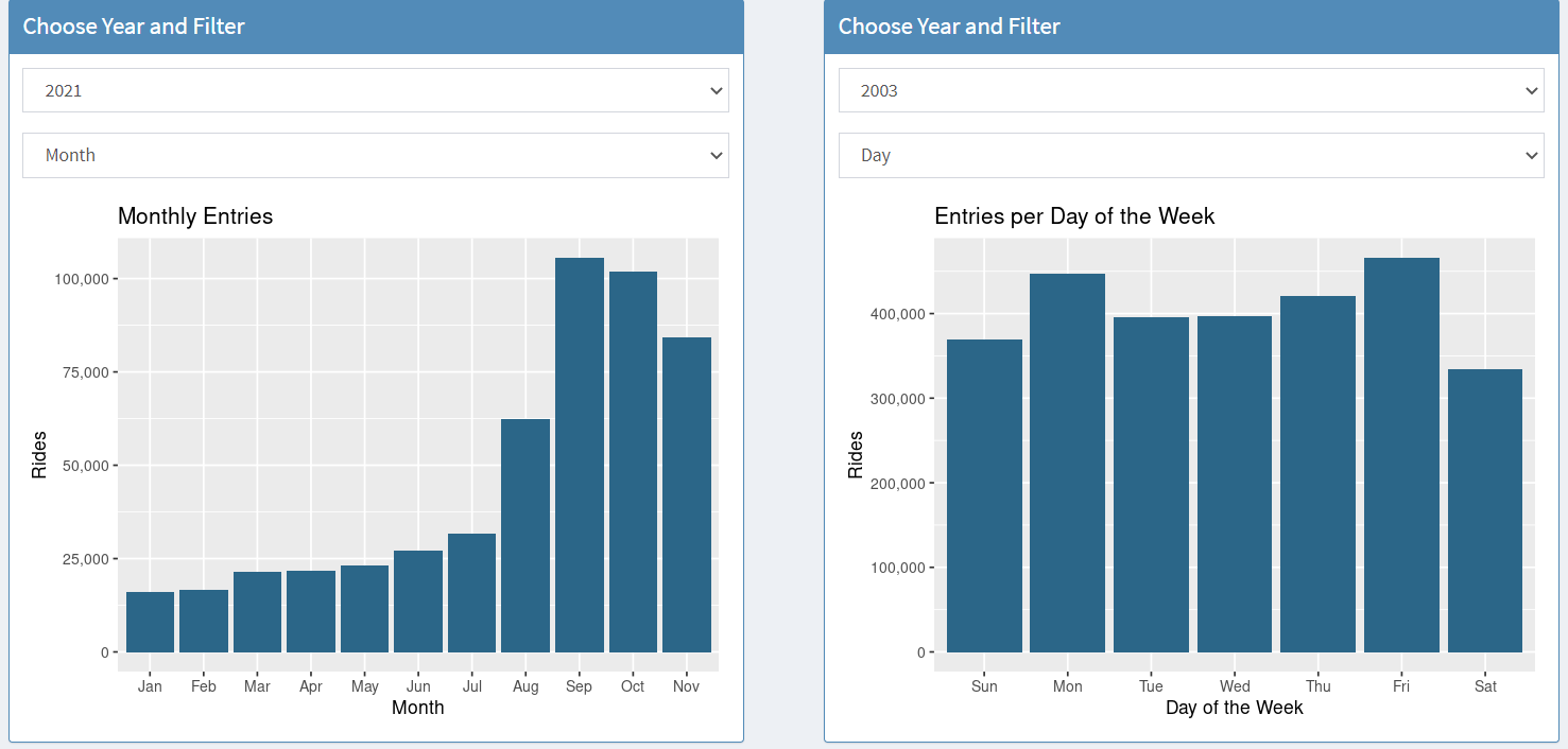
Below is an example where the ridership data is shown monthly on the left and weekly on the right
Lastly the same data is presented in a tabular form and the User can select the number of entries being displayed
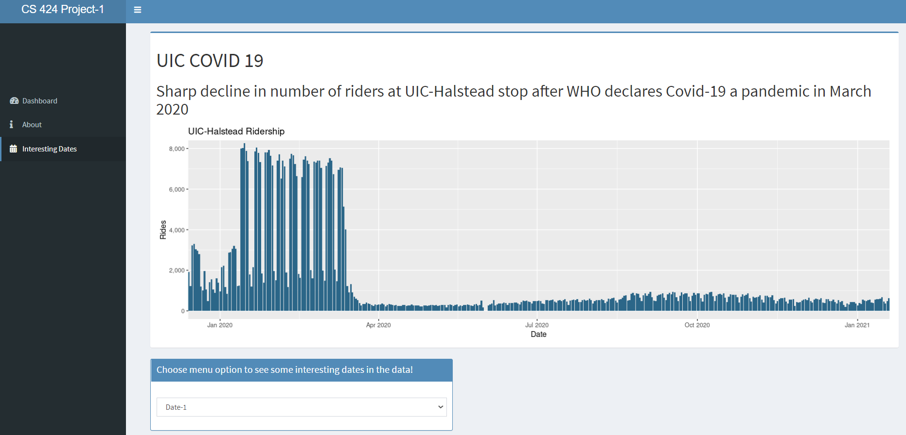
The user can choose the Interesting Dates option in the sidemenu and navigate to view the visualizations of 10 interesting trends observed in this dataset. The user can select the visualization to view from the date dropdown menu on the bottom of the screen
Data
Data Source: https://data.cityofchicago.org/Transportation/CTA-Ridership-L-Station-Entries-Daily-Totals/5neh-572f
The data used for this app was downloaded from the Chicago Data Portal website. The original dataset contains 5 columns namely, station-id, station-name, date, day-type and rides spanning from 2001 to 2021. It has 1.09 Million entries.
Data preprocessing
Firstly the original data was loaded into a dataframe and then the date was converted to a R friendly format(yyyy-mm-dd) using lubridate library. Then the dataframe was split into 3 dataframes to store as 3 separate data files containing the date and rides columns for OHare Airport, UIC-Halstead and Addison-North Main Stations only. This was done to save space and focus only on the data which I wanted to visualize.
Source Code
Github Repo: https://github.com/csk01/cta_subway
Download the repository from Github as a zip file. Extract it into any folder. Open the R code on R studio. You can run it either locally or publish it on Shiny apps. To run this project you need to download the repo form Github as a zip file and extract it. You need to have R-Studio and ShinyApps installed along with the correct dataset from the source mentioned above. Ensure that the below of libraries are up to date.
- shiny
- shinydashboard
- ggplot2
- lubridate
- DT
- scales
- dplyr
Interesting Things
The data showed a lot of trends in CTA ridership over the years. Here are some of the ones which are presented in the application
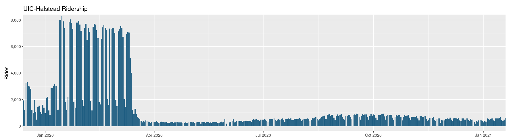
1. Impact of Covid-19
The most obivious trend was the sharp decline in number of riders at UIC-Halstead stop which was right after WHO declares Covid-19 a pandemic in March 2020.
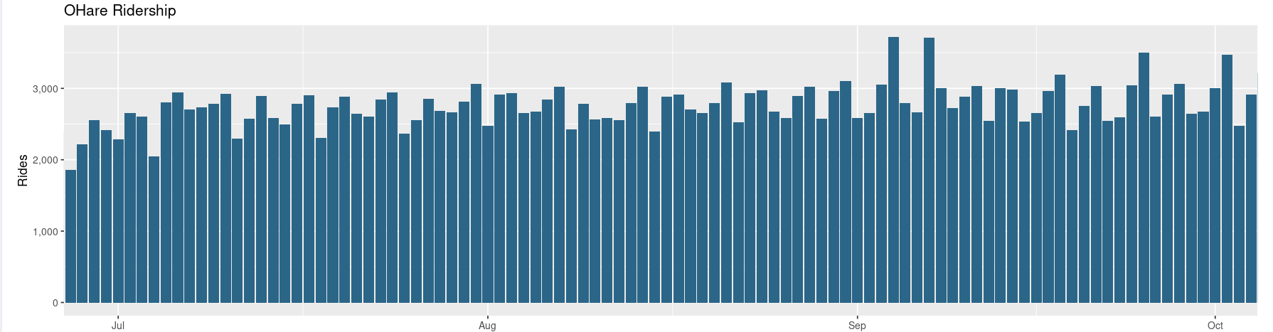
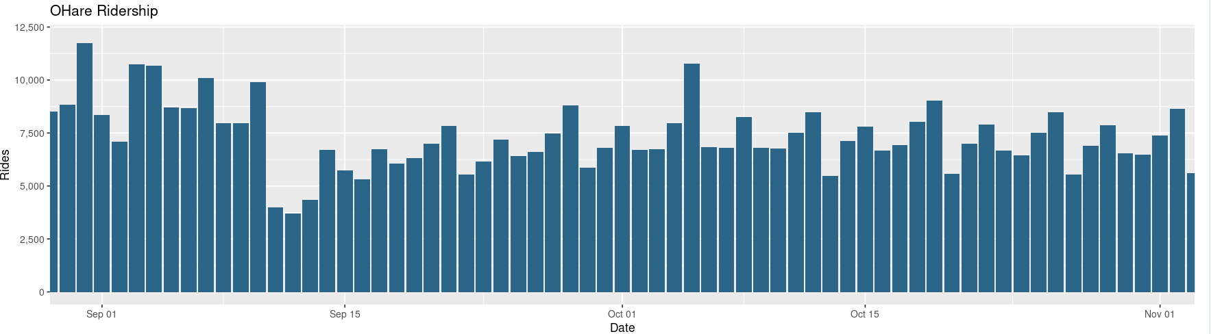
2. Cubs Game
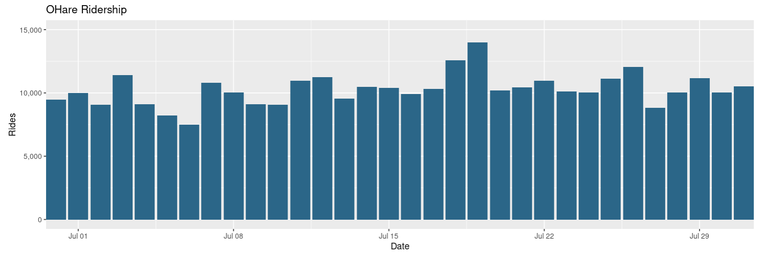
Despite dull times during the pandemic we can clearly see a two spikes in ridership at OHare due to the Cubs vs Cardinals Baseball game on Sep 4th and Sep 6th 2020
3. 9/11 Aftermath Game
Another trend was the sudden drop in rider count at the OHare CTA right after the 9/11 World Trade Center Attacks in 2001
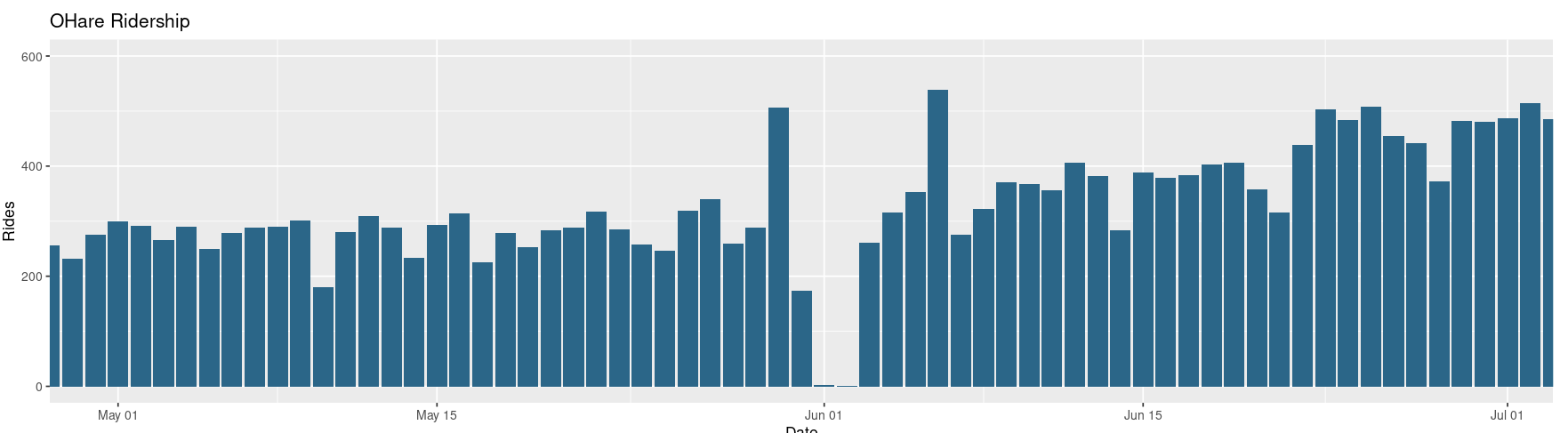
4. BLM Protest
Missing data for June can be attributed to sudden halting of services due to protests in the wake of death of George Floyd
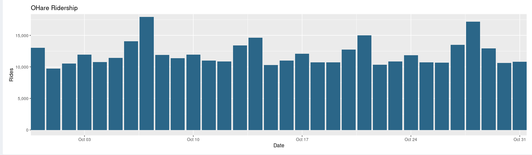
5. 7-Oct-2008
This day was an eventful day. The sudden spike on in ridership could be attributed to a number of reasons
- Obama arriving at OHare to cast his vote
- First match for the Cubs world series begins
- Kanye West performing at United center
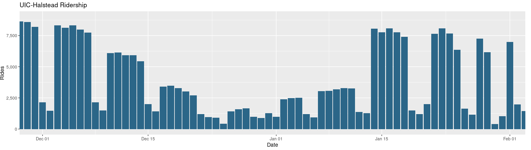
6. Winter Break UIC
We dont see the usual number of riders at the UIC-Halstead stop from Dec 15 2018 to Jan 15 2019 due to UIC’s Winter Break
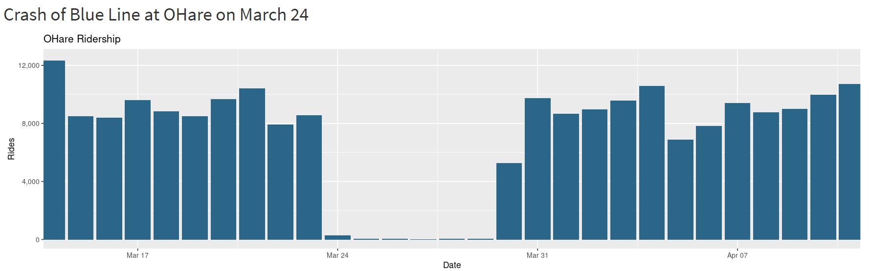
7. Train Derails
Due to the derailment of a Blue Line at OHare on March 24, the OHare station had little to no riders from March 24 - 30 2014
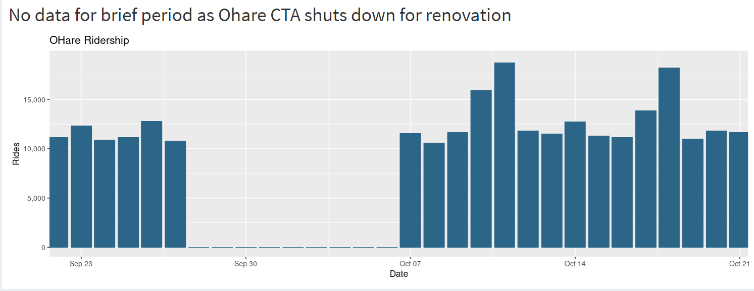
8. OHare CTA Station Renovation
In 2019, there were no data for brief period from Sep 27 - Oct 06 as Ohare CTA shuts down for renovation for a project
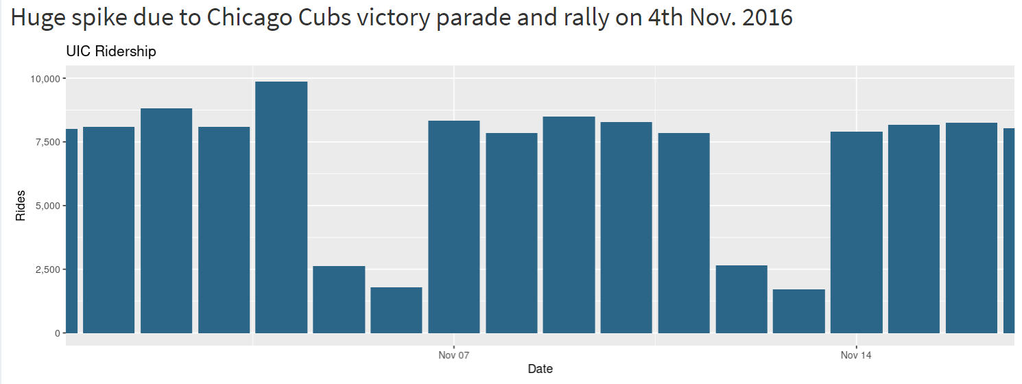
9. Chicago Cubs victory
Chicago knows how to support its basesball team. We can see an unusual increase in the number of riders because of Chicago Cubs victory parade and rally on 4th Nov. 2016 at UIC
10. Yet another Cubs game
Spike seen in OHare ridership in July 2013 due to Cubs game at Wrigley Field. This tells us that Chicagoans do not mind travelling 10 miles to support the Cubs